How to Create Custom Radio Buttons and Checkboxes
| Article #: ELN001F | Product: Flare | Version: 2021 r2 |
Summary:
This article provides details on how to create a custom look for radio buttons and checkboxes for multiple choice and multiple response questions in HTML5 output.
Full Description:
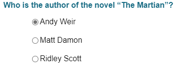
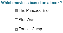
All browsers provide a default look for the radio button and checkbox input elements. If you add a multiple choice or multiple response question within Flare and do not provide any styling for these elements, then you may see these inputs represented in a different way in different browsers.
Chrome Default
Firefox Default
Microsoft Edge Default
Solution:
To create a consistent look between different browsers, the default inputs need to be first hidden and then the custom radio buttons and checkboxes can be created and styled with span tags. The great news is that Flare automatically provides span tags for all eLearning questions in HTML5 output so that all you need to do is apply styles to those tags to create the customized look.
Flare creates a span element with class radio for every radio button input type used in multiple choice questions, and a span element with class checkbox for every checkbox input type used in multiple response questions. The steps below to create customized looks for these input types will use these span elements automatically generated by Flare. This way we do not need to make any edits to the question sections in the topics.
-
Copy the CSS from the code snippet below and paste it to the bottom of your project stylesheet. If you have tablet and mobile medium settings in your stylesheet, paste it before the section where @media tablet section starts.
-
Save changes to the stylesheet, then build the target to test the changes.
-
View the output to see the customized inputs and see if adjustments are needed. You may want to make adjustments to update the colors for your branding needs or maybe there are other styles being used in the project stylesheet which cause misalignment of some of the buttons.
-
The radio button and / or the check mark is not aligned with each of the answer options.
-
The inner circle and / or the check mark is not centered in the radio button and checkbox.
-
Change the background color of the selected checkbox and inner circle of the selected radio button to a different color.
Solution
This can be adjusted by changing background-color for the .multipleChoiceItem input:checked ~ .checkbox and .multipleChoiceItem .radio:after style.
CopymultipleChoiceItem input:checked ~ .checkbox
{
background-color: #00CED1; /*adjustment for background color of selected checkbox answer*/
}
.multipleChoiceItem .radio:after
{
top: 3px;
left: 3px;
width: 10px;
height: 10px;
border-radius: 50%;
background-color: #00CED1; /*adjustment for color of inner circle for selected answer*/
}
.multipleChoiceItem input /*hide the browser default inputs*/
{
    position: absolute;
    opacity: 0;
    cursor: pointer;
    height: 0;
    width: 0;
}

.checkbox /*create the custom empty checkbox*/
{
    position: absolute;
    top: 0;
    left: 0;
    height: 18px;
    width: 18px;
    background-color: #eee;
}

.multipleChoiceItem:hover input ~ .checkbox /*sets the background color for the hovered checkbox*/
{
    background-color: #ccc;
}

.multipleChoiceItem input:checked ~ .checkbox /*sets the background color for the selected checkbox*/
{
    background-color: #076685;
}

.checkbox:after
{
    content: "";
    position: absolute;
    display: none;
}

.multipleChoiceItem input:checked ~ .checkbox:after
{
    display: block;
}

.multipleChoiceItem .checkbox:after /*creates the checkmark for the selected checkbox*/
{
    left: 6px;
    top: 2px;
    width: 4px;
    height: 9px;
    border: solid white;
    border-width: 0 2px 2px 0;
    -webkit-transform: rotate(45deg);
    -ms-transform: rotate(45deg);
    transform: rotate(45deg);
}

.radio /*create the custom empty radio button*/
{
    position: absolute;
    top: 0;
    left: 0;
    height: 18px;
    width: 18px;
    background-color: #fff;
    border: 1px solid #ccc;
    border-radius: 50%;
}

.multipleChoiceItem:hover input ~ .radio /*sets the background color for the hovered radio button*/
{
    background-color: #eee;
}

.multipleChoiceItem input:checked ~ .radio /*sets the background color for the selected radio button*/
{
    background-color: #fff;
}

.radio:after
{
    content: "";
    position: absolute;
    display: none;
}

.multipleChoiceItem input:checked ~ .radio:after
{
    display: block;
}

.multipleChoiceItem .radio:after /*creates the inner circle for the selected radio button*/
{
    top: 4px;
    left: 4px;
    width: 10px;
    height: 10px;
    border-radius: 50%;
    background-color: #076685;
}
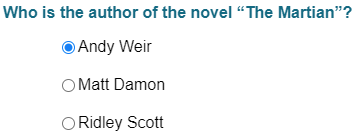
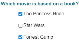
Examples
After using the styles above, the custom radio buttons and checkbox may look like this:
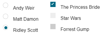
Issues to fix:
Solution
This can be adjusted by adding margin-top or margin-bottom to the .radio and .checkbox style settings.
.checkbox
{
    position: absolute;
    top: 0;
    left: 0;
    height: 18px;
    width: 18px;
    background-color: #eee;
    margin-top: 10px;  /*adding margin-top to move custom radio button down*/
}

.radio
{
    position: absolute;
    top: 0;
    left: 0;
    height: 18px;
    width: 18px;
    background-color: #fff;
    border: 1px solid #ccc;
    border-radius: 50%;
    margin-top: 10px; /*adding margin-top to move custom checkbox down*/
}
Solution
This can be adjusted by changing the top and left settings for .multipleChoiceItem .checkbox:after and .multipleChoiceItem .radio:after styles.
.multipleChoiceItem .checkbox:after
{
    left: 6px;
    top: 4px; /*adjustment for position of inner circle for selected answer*/
    width: 4px;
    height: 9px;
    border: solid white;
    border-width: 0 2px 2px 0;
    -webkit-transform: rotate(45deg);
    -ms-transform: rotate(45deg);
    transform: rotate(45deg);
}

.multipleChoiceItem .radio:after
{
    top: 3px; /*adjustment for position of checkbox for selected answer*/
    left: 3px;  /*adjustment for position of checkbox for selected answer*/
    width: 10px;
    height: 10px;
    border-radius: 50%;
    background-color: #076685;
}
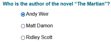
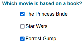
After fixing the above issues in the project stylesheet, the custom radio buttons look like this:
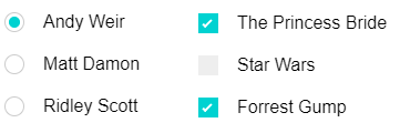
These are just examples of how the radio buttons and checkboxes can be customized and assume the eLearning elements are using the parent styles. If you created custom style classes for the eLearning elements, then the complex selector styles you use may need to be adjusted (See Using Complex Selectors for MadCap Elements with Other Styles). You may also want to discuss with your developers this and other options to customize your eLearning questions. The styles and methods discussed in this article are based on examples from this W3School article.
Attribution:
|
Last updated: 8/20/2021 |
Author: Marvin Mallari |
Contributions by: MadCap QA |